

Americaneagle.com
Over the summer of 2020 I had the opportunity to intern at a web design and development consultancy called Americaneagle.com (AE). During my time as a UI/UX intern on the Graphics team at AE, I worked on several different client projects and learned about what all goes into designing and building a website.
Skills Used


Confidentiality Disclaimer
As part of my 2020 summer internship I had the chance to work as a UI/UX intern at Americaneagle.com. Due to a confidentiality agreement with Americaneagle.com, I cannot disclose specific details about the projects that I worked on.
Acknowledgements
Due to the nature of my summer internship, I worked very closely with many members of the Americaneagle.com Graphics team in order to complete the work shown below. I would especially like to say a huge thank you to my manager, Melvin Williams, who led me through each of these projects and taught me everything I learned this summer. This experience would not have been possible without him and his willingness to help and the work below showcases that.
Project #1
Wireframes to Full Designs — An Iterative Process
One of the first projects I had the opportunity to work on while at AE was a website redesign for a healthcare company. When I got to AE this project was already underway, so I hopped in and helped do a few things to finish the design part of the project. First of all, I worked on creating the full designs for certain wireframed pages that had already been accepted by the client. This meant that I needed to convert wireframes to fully designed website pages by applying the brand guidelines. During this stage I learned what a Design System Manager (DSM) is and how to apply layer and text styles to different components in Sketch. Applying a DSM means making wide scale changes in the future is a lot easier. When starting the process of converting from wireframe to full design, I was able to use previous work as an example. My manager, Melvin Williams, and other members of the design team at AE, had already completed this process for a few pages, so I used these finished pages as an example as I completed the pages assigned to me. This was helpful because it allowed me to better understand how direct the translation should be and allowed me to see when certain fonts and colors were used. This process was a very iterative process and involved me doing the work, showing it to Melvin, receiving feedback and then implementing that feedback in the design. Once I had done this process a few times and Melvin felt that the designs looked good we would present them to the AE internal team and the client and would receive more feedback that needed to be implemented. I really enjoyed working through this process as it gave me a good understanding of how design work gets checked and “okayed” in a company with external clients.
Translating Desktop Designs to Mobile Designs
Another important skill I learned through this first project was how to translate desktop designs to mobile designs. This was a process that had again already been done for certain pages, so I was able to use that work as a guide. However, I also learned some best practice tips about this translation from Melvin. First of all, I learned that typically everything in the left-hand column of the desktop page goes before everything in the right-hand column in the mobile version. Additionally, I learned that tabbed tables and elements on a desktop page typically become an accordion style element in the mobile version. I really enjoyed the process of creating mobile versions of the desktop designs and this is a skill I utilized many times over the course of the summer.
The Importance of the DSM
Halfway through my time working on this project, the client decided that they were not 100% happy with the brand direction and wanted to make some changes to things like font, color and imagery. At this stage I got to be a little bit creative and help brainstorm what the new color and imagery direction might look like. I played around with creating different color palettes and learned how to edit photos in Adobe Lightroom to make different variations of the hero images. Once the final brand direction was decided on I had to go back through the designs and make changes, which was not a difficult task because of the DSM that was used.
File Organization for A Smooth Transition to Front End Development
Finally, I spent some time organizing the Sketch files for this project by grouping the appropriate elements, ordering the layers and groups from top to bottom, making sure all elements were attached to components in the DSM and making sure icons and images were exportable. All of these organizational steps help the front end developers when the project moves on to them.
Wireframes to Full Design — Doctor Listing Page


Wireframes to Full Design — Search Results Listing Page


Project #2
Rough Page Mockups to Wireframes
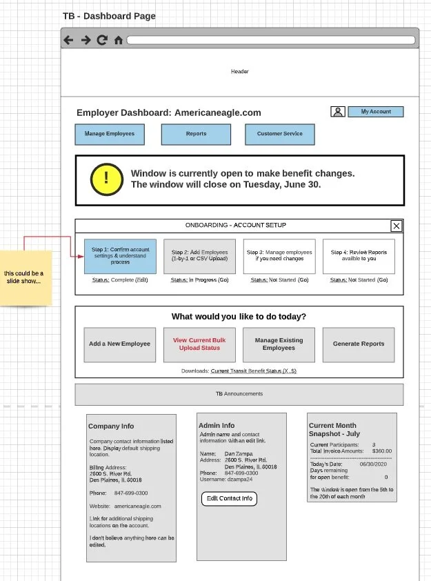
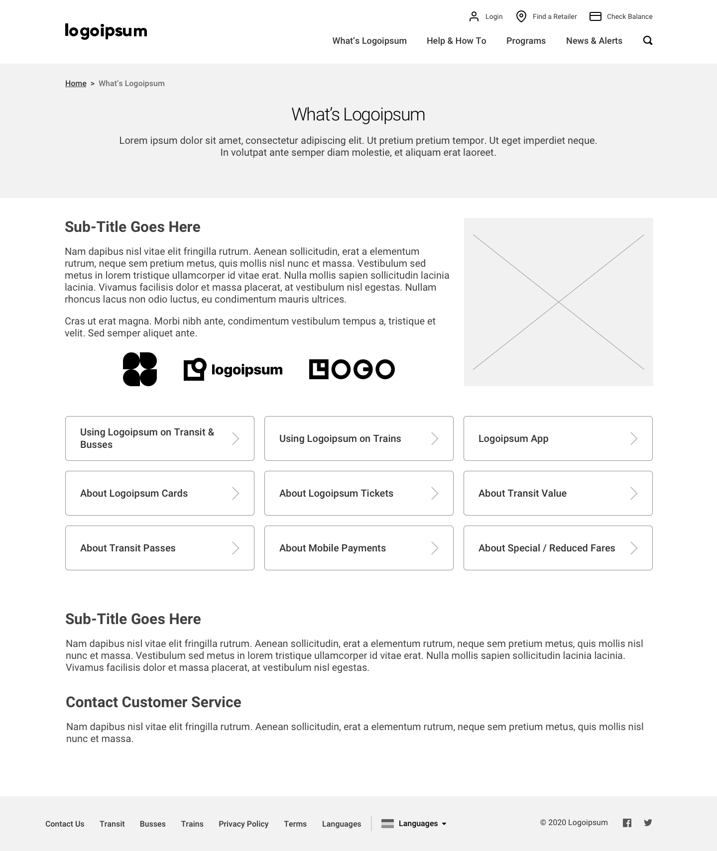
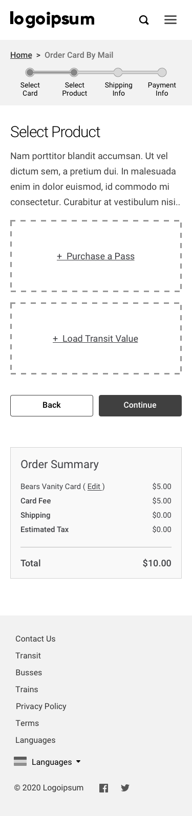
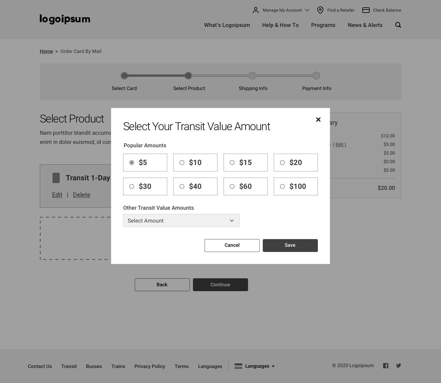
Another project that I spent time on while working at AE involved creating wireframes for a transportation company. My task for this project was to take rough mockups of different pages and turn them into more realistic wireframes. Similar to the first project I had worked on, I had previous work that was given to me to use as a guide for this process. The previous work allowed me to see how certain elements in the rough mockups corresponded to elements in the wireframes, which was helpful because I could apply the same translation to the wireframes I created.
Completing User Flows
Another aspect of this project that I worked on was making sure all the necessary pages were accounted for. I was given various site maps and flow diagrams outlining different processes and I had to make sure that all of the pages for each of those flows had a corresponding wireframe version.
Making Judgment Calls and Improving Usability
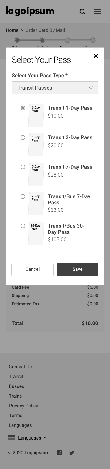
While most of the work I did for this project involved one-to-one translating from rough mockup to wireframes, there were some times when I got to make designerly choices with the help of Melvin. The mockups of the pages that we were given were essentially just text boxes with some sort of layout, so there were certain pages where Melvin and I worked together to create components that were more usable than the original mockup. For example, on the add a pass and add a value page we decided to use the large buttons that would open a popup instead of the original links that the mockup included. Getting to make these choices made me realize that as a UX designer these kinds of decisions are your expertise and so when you know there is a better way to do something it is alright to stray from the path and make that choice.
Similarities to First Project — Desktop to Mobile and an Iterative Process
Similar to the other project that I worked on, all of the desktop wireframes that I created also had to have mobile versions, so I was able to apply the skills I had learned from the first project on this project. This project was also similar in the sense that I followed a very iterative process where I would create the wireframes, show them to Melvin and receive feedback and then would implement this feedback. After working directly with Melvin and getting the wireframes to a place where we were both happy, we shared the wireframes with the internal team to receive feedback before presenting them to the client.
Creating a Clickable Prototype
The final part of this project that I was in charge of was turning the wireframed pages from individual stand alone pages into a clickable prototype. I made use of a Sketch plugin called Craft and InVision to connect the different pages. This was important for this project because there were a lot of different user flows that the client had requested and they wanted to be able to click through the different flows.
Translation from Mockup to Wireframe
Site Maps and User Flows


Translation from Mockup to Wireframe


More Designerly Choices in Wireframes


Project #3
Style Guide Secondary Research
The final project I spent time working on at AE was the creation of a style guide for the healthcare client I mentioned in the first project. These style guides are something that AE has done in the past for other projects and is useful for the AE sales team. The style guide is a book that is given to the client at the end of the project outlining all the important steps that AE took to complete the project and all the fine details of the design. For example the style guide includes things like a creative brief, a Google analytics review, content strategy, web strategy, site maps, UI components, design elements, design examples, design specifications, web copy and health literacy standards, content strategy guidelines and a glossary. To start the creation of this style guide I did a lot of secondary research into other style guides. I was given a few examples of style guides that AE had made in the past, so I went through these to better understand what elements the style guide should include and the general format. The notes I took while conducting this research can be found here. This research also made me realize what sort of page templates I should create for things like section divider pages and content pages. Before creating these template pages I also did some research into other print spreads to see what sorts of styles and layouts were popular and would work for the style guide.


Designing Template Pages
After completing this research I started to create page templates in Sketch. After creating the general layouts I taught myself Adobe InDesign because this is the tool that was used to create the previous style guides and the tool that is most widely used to create print material. I then recreated the template pages I created in Sketch in InDesign.


Creating Various Rough Drafts
Next I worked on sketching out a rough draft of the order of the style guide specifying the different sections I would include and the type of content that would go in each section. After having a general understanding of the order of the book I started to collect actual content from different members of the project team. For example, I gathered the content strategy plan from the content team and the personas and user journeys from member of the Graphics team that worked on the project before me. Once I had all of the relevant content I created a PDF rough draft of the book which followed the order described in the sketched rough draft but added the pieces of content into their appropriate sections.
Applying Brand Guidelines
I also went through the content I was given and made sure to resize and recreate certain tables and charts so that they would fit in the letter-sized format and so that they followed the new brand guidelines (color, font, etc.). The final thing I did for the style guide was figure out what kind of imagery should be used. Similar to what I did when working on the rebranding of the site from the first project, I played around with editing photos in Adobe Lightroom and made mood boards of the different types of imagery to be included. While I was not able to completely finish the style guide during my time at AE, I laid a lot of the ground work and hope to see some of the work I did in the final version.


Key Takeaways
It is important to justify all of your design decisions
Make multiple versions and present those internally (but never present too many versions to the client)
Want to make the client happy but also have to guide them because they hired you to be the expert
Important to take note of all pieces of feedback, weed through that feedback and then apply necessary changes
DSMs are super helpful and prevent you from having to make changes to everything individually
Keeping Sketch files organized is very helpful and is important when moving the project forward
It is important to think about the work you are doing in the bigger picture (need to think about how you can help move it forward easier, where it came from, etc.)
Always ask questions when you aren’t sure about something, don’t just guess
Do lots of research into what exists → look for examples of places that are doing certain things well and steal when you can → no point in trying to reinvent the wheel
Keep track of the work you have done on other projects because it will probably be useful for future projects
Contributions
I would like to again say a special thank you to my manager Melvin Williams and to all of the other helpful and kind Americaneagle.com employees I crossed paths with.